background-blend-mode
The background-blend-mode property is used to specify the blend mode for each background layer of an element.
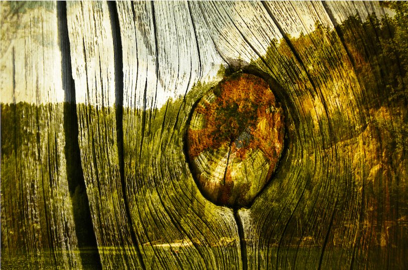
Using the background-blend-mode property, you can blend the background layers (images and color) of an element.
The property takes one or more blend modes as a value—this value specifies the formula used to blend or mix the colors of the background image with the color — or other background images — behind it.
Each background layer must blend with the element’s background layer that is below it and the element’s background color. Background layers must not blend with the content that is behind the element, instead they must act as if they are rendered into an isolated group.
If the element has multiple background layers, and you specify a (comma-separated) list of blend modes for these layers, the background-blend-mode list must be applied in the same order as background-image. This means that the first blend mode in the list will apply to the first background image in the list of background images—the layer that is on top. If a property doesn’t have enough comma-separated values to match the number of layers, the user agent must calculate its used value by repeating the list of values until there are enough.
If the background shorthand is used, the background-blend-mode property for that element must be reset to its initial value.
Trivia & Notes
The background-blend-mode property is used to blend together the background layers of an element. If you want to blend elements together, you can use the mix-blend-mode property.
Official Syntax
-
Syntax:
background-blend-mode: <blend-mode> - Initial: normal
- Applies To: All HTML elements
- Animatable: no
Values
- <blend-mode>
-
Refer to the
<blend-mode>entry for a list of possible values.
Examples
The luminosity blend mode can be used to create monochrome “tinted” image effects.
For example, the following example blends an element’s background image with its background color, using the luminosity value.
.el {
    background-image: url(blend-mode-example.jpg);
    background-color: #51B7D3;
    background-blend-mode: luminosity;
}
The result of such a blending operation looks like the following image:

luminosity blend mode.Similarly, you can blend together two or more images, and you can use different blend modes for each background layer.
The following example blends together the same image with a linear gradient background image, using the overlay blend mode.
.el-2 {
    background-image: linear-gradient(to right, #69B62F, #DE3375), url(blend-mode-example.jpg);
    background-blend-mode: overlay;
}
The above example will give the following result:

overlay blend mode.If you have two background images, you can blend these images together and blend them with the element’s background color.
.el-3 {
    background-image: url(blend-mode-example-texture.jpg), url(blend-mode-example.jpg);
    background-color: olive;
    background-blend-mode: hard-light;
}
The result of applying this blending effect looks as shown in the following image:

hard-light blend mode.Depending on the blend mode you use for each layer, the result will look different.
Check the live demos for the three examples in the Live Demo section below, and change the blend mode values to see how the effect changes.
Live Demo
Here is a live demo with some examples for different blend modes:
View this demo on the Codrops PlaygroundAn interactive demo
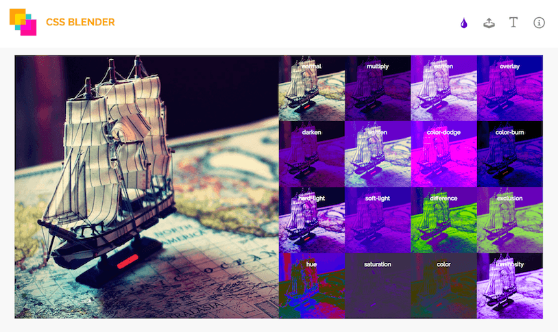
Even with the definition of each blend mode known, it is very hard (if not impossible) to predict how applying a certain blend mode will affect the image(s) it is applied to. Picking a blend mode is usually a case of trial and error—you may keep changing modes until you are satisfied with the end result.
For that reason, I have created an interactive demo that you can use to test the effect of different blend modes on a background image of your choice. You can also choose the background color.
A list of thumbnails will show you the result of applying the different blend modes to your input, and you can click on each thumbnail to preview the effect in the larger preview pane.

You can play with the interactive demo here.
Browser Support
CSS background-blend-mode
Allows blending between CSS background images, gradients, and colors.
W3C Candidate Recommendation
Supported from the following versions:
Desktop
- 35
- 30
- No
- 22
- 7.1
Mobile / Tablet
- 8
- 66
- No
- 66
- 60