border-bottom-style
The border-bottom-style property is used to specify the line style of the bottom border of an element (solid, double, dashed, etc.), unless there is a border image set.
Official Syntax
-
Syntax:
border-bottom-style: none | hidden | dotted | dashed | solid | double | groove | ridge | inset | outset
- Initial: none
- Applies To: all elements
- Animatable: no
Values
- none
-
Displays no border. Color and width set on the border will be ignored. The border width value will be `0` unless there’s a border image set.
In case of table cell and border collapsing, the none value has the lowest priority: it means that if any other conflicting border is set, it will be displayed.
- hidden
-
Similar to
none, it displays no border. Color and width set on the border will be ignored. The border width value will be `0` unless there’s a border image set.In case of table cell and border collapsing, the hidden value has the highest priority: it means that if any other conflicting border is set, it won’t be displayed.
- dotted
- Displays a border as a set of rounded dots. The radius of the dots is equal to half of the width of the border.
- dashed
- Displays a border as a series of square-ended dashes.
- solid
- Displays a border as a solid straight line.
- double
- Displays two parallel solid lines with some space between them. The thickness of the lines is not specified, but the sum of the lines and the space must equal to the value of the border-bottom-width property’s value.
- groove
- The displayed border looks as if it were carved in the canvas. This is typically achieved by creating a “shadow” from two colors that are slightly lighter and darker than the color specified using the border-bottom-color property.
- ridge
-
The border looks as if it were coming out of the canvas in a 3D effect. It is the opposite of the effect achieved by the
groovevalue. - inset
-
Displays a border that makes the element look as if it is “sunken” or embedded into the page.
When applied to a table cell with border-collapse set to collapsed, this value behaves like
groove. - outset
-
Displays a border that makes the element look as if it is embossed with a 3D effect. It has the opposite of the effect achieved by the
insetproperty.When applied to a table cell with border-collapse set to collapsed, this value behaves like
ridge.
Notes
The border style value can also be inherited from the element’s parent’s border style property.
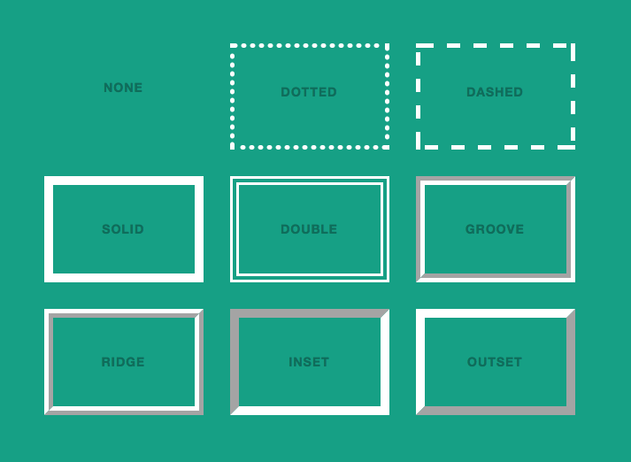
The following image shows the result of applying any of the above styles to an element’s border.

Not all browsers may render the styles the same way. Chrome, for instance, currently renders the dots as rectangular dots not circular ones.
The specification does not specify the amount of spacing between the dots and the dashes. Browser implementations are encouraged to choose a spacing that makes the corners symmetrical.
The specification also does not define how borders of different styles should be joined in the corner. Also note that rounded corners may cause the corners and the contents to overlap, if the padding is less than the radius of the corner specified using the border-radius property.
The color of borders drawn for values of groove, ridge, inset, and outset depends on the element’s border color properties, but browsers may choose their own algorithm to calculate the actual colors used. For instance, if the border-bottom-color has the value silver, then a browser could use a gradient of colors from white to dark gray to indicate a sloping border.
Examples
The following are all valid border-bottom-style values set on an element. The element’s border width and border color are also set using the border-bottom-width and border-bottom-color respectively.
.element {
    border-bottom-width: 10px;
    border-bottom-color: red;

    border-bottom-style: dashed;
    /* or */
    border-bottom-style: inset;
    /* or */
    border-bottom-style: dotted;
}
Browser Support
The property works in all major browsers: Chrome, Firefox, Safari, Opera, IE, and on Android and iOS.