clip-path
The clip-path property is used to specify a basic shape (<basic-shape>) or reference an SVG path (<clipPath>) to be used as a clipping path on the element.
The element can be an HTML element or an SVG element. (See Syntax and Values sections.)
Concepts and Terminology
What is “clipping”?
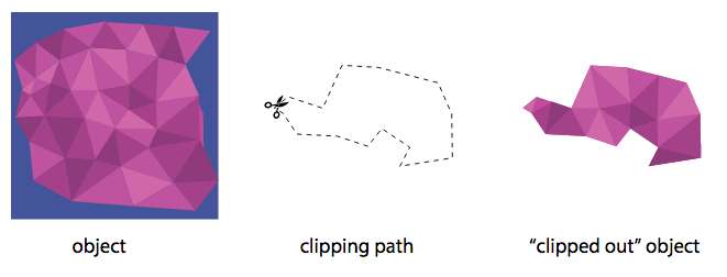
Clipping is a graphical operation that allows you to fully or partially hide portions of an element. The portions of the element that are shown or hidden are determined by a clipping path.
Clipping Paths & Regions
A clipping path can be either a basic shape or a vector path. This path defines a region (in the absence of anti-aliasing) where everything on the “inside” of this region is allowed to show through but everything on the outside is “clipped out” and does not appear on the canvas. This region is known as the clipping region.
Conceptually, any parts of the element that lie outside of a clipping region are not drawn. This includes any content, background, borders, text decoration, outline and visible scrolling mechanism of the element to which the clipping path is applied, and those of its descendants.

A clipping path is conceptually equivalent to a custom viewport for the element it applies to. Thus, it affects the rendering of an element. It does not affect the element’s inherent geometry. The boundaries of a clipped element must remain the same as if it were not clipped. The element will affect the flow around it as it normally would, and every other element on the page will still see and treat the element as if it were still rectangular, even if it’s clipped to a non-rectangular shape. If you want to change the way the content around the element flows and have it respond to the defined shape of the clip path, you can use the shape-outside property.
If the clipping region exceeds the bounds of the user agent’s document window, content may be clipped to that window by the native operating environment.
An element’s ancestors may also clip portions of their content (e.g., via their own clip or clip-path properties and/or if their overflow property is not visible). What is rendered is the cumulative intersection.
Clipping Regions and Pointer Events
The clip-path property should restrict the areas of the element that accept pointer events to the clip path it defines/references. Pointer events must not be dispatched on the clipped (non-visible) regions of a shape.
This means that the element should not respond to pointer events like hover or click events even if it is hovered or clicked outside its visible region.
Animating Clipping Paths
Clipping paths defined using basic shapes can be animated just like shapes defined for the shape-outside property can.
In short, a clipping path can be animated from one shape to another because it is made up of points. These points have coordinates that are either length or percentage values. And since lengths and percentages are animatable, shapes can be animated as well. So, basically, you’re animating the position of the points that make up a shape.
However, note that you can animate one shape into another only by using the same shape function for the initial and final shape, because the initial and final shape must have the same number of points, otherwise the animation is not possible.
For more information please see the shape-outside property entry.
Trivia & Notes
The deprecated clip Property
Before the clip-path property was introduced, in CSS 2.1, the clip property was used to clip parts of an element, similar to the way clip-path works.
However, the clip property was very limited: the only supported clipping shape was a rectangle shape created using the rect() function.
Moreover, clip only worked on absolutely-positioned element, which limites its use a lot. Even in SVG, it was limited to specific elements as well.
These reasons, among others, are why the clip-path property was added to the SVG specification and then adapted by the CSS Masking module today.
If you’re interested, you can read more about the clip property in its entry.
Using clip-path with CSS Shapes
The clip-path property is a great companion to the CSS Shapes properties, particularly the shape-outside property.
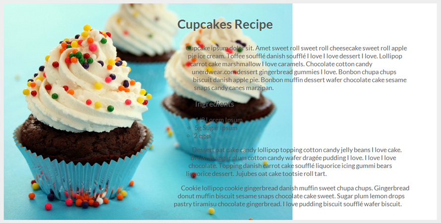
Using shape-outside you can change the way content flows around an element because the shape applied using shape-outside changes the geometry of the element’s float area. However, the shape does not change anything else about the element, like backgrounds and borders and such. This means that any borders and background images will not adapt to the shape created on the element. So, even though the element’s float area changes, the content around the element may end up being on top of the element’s background image.

shape-outside property. The background area of the element remains unchanged, resulting in the text overlapping it and therefore getting an unwanted result.
In order “clip” the background of the element to match the defined shape, you can use the clip-path property. All you have to do is pass in the same shape function that you used in the shape-outside property to the clip-path property, and the element’s background image will then be clipped to the defined shape, resulting in a more defined shape altogether.

clip-path property to visually define a CSS Shape applied using shape-outside.
You can read more about CSS Shapes and using clip-path with them in the shape-outside property entry, and see the above demo live in the Examples section below.
Official Syntax
-
Syntax:
clip-path: <clip-source> | [ <basic-shape> || <geometry-box> ] | none /* where */ <clip-source> = <url> /* URL references an SVG <clipPath> element */ /* and */ <geometry-box> = <shape-box> | fill | stroke | view-box - Initial: none
- Applies To: All elements. In SVG, it applies to container elements without the <defs> element and all graphics elements
-
Animatable: See
shape-outside
Notes
The <basic-shape> is a shape created using the basic shape functions. See the <basic-shape> entry for details.
The <geometry-box> can be either a <shape-box> or one of the three keywords: fill, stroke, view-box.
The <shape-box> defines the reference box for the <basic-shape>s created using the shape functions. It can be one of the following values: margin-box, border-box, padding-box, content-box. These boxes are applied and can be used on HTML elements.
The other three geometry box values are applied to SVG elements. SVG elements don’t have a box model, and so the <shape-box< values will have no effect on them. As a matter of fact, the <shape-box> values will resolve to the value fill.
On the other hand, the SVG geometry box values will resolve to border-box when used on an HTML element.
Values
- <clip-source>
-
A
<url>pointing to an SVGclipPathelement that is to be used as a clipping path. - <basic-shape>
-
A basic shape function as defined in the CSS Shapes module (See the
shape-outsideproperty entry). A basic shape makes use of the specified reference box to size and position the basic shape. If no reference box is specified, theborder-boxwill be used as reference box. - <geometry-box>
-
Can be either a
<shape-box>orfill,stroke, orview-box.A
<shape-box>is applied to an HTML element and can be one of four possible box values:margin-box,border-box,padding-box, andcontent-box.If specified in combination with a
<basic-shape>it provides the reference box for the<basic-shape>. (See theshape-outsideproperty entry for details and more information.)If specified by itself, uses the edges of the specified box as a reference box, including any corner shaping (e.g. defined by
border-radius), as a clipping path.In addition to the
<shape-box>values, the other three values can be applied to SVG elements and have the following meanings:filluses the object bounding box as reference box.Strokeuses the stroke bounding box as reference box.view-boxuses the nearest SVG viewport as reference box.If a
viewBoxattribute is specified for the SVG viewport creating element, the reference box is positioned at the origin of the coordinate system established by theviewBoxattribute, and the dimension of the reference box is set to the width and height values of theviewBoxattribute.
For SVG elements without associated CSS layout box, the values
content-box,padding-box,border-boxandmargin-boxcompute tofill.For elements with associated CSS layout box, the values
fill,strokeandview-boxcompute toborder-box. - none
- No clipping path gets created.
Notes
A computed value of other than none results in the creation of a stacking context the same way that CSS opacity property does.
If the URI reference is not valid (e.g it points to an object that doesn’t exist or the object is not a clipPath element), no clipping is applied.
Examples
The following are examples of using the basic shape functions with the clip-path property:
clip-path: polygon(15px 99px, 30px 87px, 65px 99px, 85px 55px, 122px 57px, 184px 73px, 198px 105px, 199px 150px, 145px 159px, 155px 139px, 126px 120px, 112px 138px, 80px 128px, 39px 126px, 24px 104px);
clip-path: circle(70% at 0% 50%) padding-box;
clip-path: inset(10px 20px 30px 40px round 10px) margin-box;
clip-path: ellipse(farthest-side closest-side at 25% 25%);
The following is a live demo of the above example using the clip-path property in conjunction with the shape-outside property. The code looks like the following:
.element {
    /* use the same shape in both properties */
    clip-path: circle(70% at 0% 50%);
    /* set the reference box of the Shape to be the same as the clip-path"s for this example */
    shape-outside: circle(70% at 0% 50%) border-box;
}
View this demo on the Codrops Playground
The following example uses an SVG path as a clipping path:
.element {
    /* ... */
    clip-path: url(#svgClipPathID);
}
The SVG in this example is embedded in the document:
<!DOCTYPE html>
<html>
    <body>
        <!-- ... -->
        <svg>
            <defs>
                <clipPath id="thePath" clipPathUnits="objectBoundingBox">
                    <polygon fill="none" stroke="#000" stroke-miterlimit="10" points=".3,0 .5,.3 .7,0 .8,.4 1,.8 .5,.7 .4,.9 0,.6"/>
                </clipPath>
            </defs>
        </svg>
    </body>
</html>
The result of applying the above path to an image would look like the following:

The following is a live demo of the above example. Note that the demo may or may not work in your browser. Please see the note on browser compatibility below for more information.
View this demo on the Codrops PlaygroundNotes: Tool For Clip-Path
The following is a screenshot of a nice tool by CSSPlant that allows you to visually create a clip path for the clip-path property. The tool then generates the code for a polygon() function which you can then directly use as a value for clip-path.

The clip path generator can be very useful and time-saving, so make sure to check it out!
Live Demo
The following demo uses the polygon() function to clip an element using clip-path. The element has a scroll bar that is only partially visible because it lies almost completely outside the clipping region defined by the clip path.
Moreover, the polygonal clip path is animated. It animates into another shape when you hover over the element.
Try changing the values of the clip path and/or removing it to see how the element looks like in all cases.
View this demo on the Codrops PlaygroundBrowser Support
CSS Masks
Method of displaying part of an element, using a selected image as a mask
W3C Candidate Recommendation
Supported from the following versions:
Desktop
- No
- 53
- No
- No
- No
Mobile / Tablet
- No
- No
- No
- No
- 60
Notes
This module, as you can see in the support table above, hasn’t been fully implemented in all browsers, so you’re probably not going to be able to use all features even in browsers that have implemented certain properties (for the time being). In Canary, for example, the clip-path property accepts a shape box to specify its reference box, but that’s not yet implemented in the stable channel of Chrome.
In the meantime, you can check out this open source feature support table by Alan Greenblatt on GitHub. The purpose of this table is to provide some insight into what the current state of affairs is with various browser implementations of CSS Clipping and Masking features.