position
The position property is used to set the position of an element on the page.
Using this property you can choose whether to have the element be positioned according to the normal flow of the page (default), you can shift its position or “nudge” it while maintaining its position in the flow, you can position it relative to another element on the page, or you can position it relative to the viewport.
All elements are by default positioned “statically” on a page. A static position defines the position of an element in the normal flow of the page. It is the default position of every element. When an element is referred to as a positioned element, it means that its position has been changed from being static, to one of four available values: relative, absolute, fixed, sticky.
In addition to the five values mentioned, two new positioning values have been added in CSS3: page and center.
Once an element has been positioned (given a non-static value), its position on the page is determined using the offset properties: top, right, bottom, and left.
Offset properties only work on positioned elements, so using them on static elements will not work. They are used to set the offsets of the element relative to its positioning context.
A positioning context is practically a coordinate system which you use to determine the position of an element using the offset properties.
A relatively positioned element (position: relative) establishes a positioning context for its absolutely positioned descendants (see next), and also establishes a positioning context for itself. This means that you can shift or nudge the element from its original position using the offset properties. The positioning context for the element in this case is its original position in the page flow, with the top left corner being the origin of that context (or coordinate system).
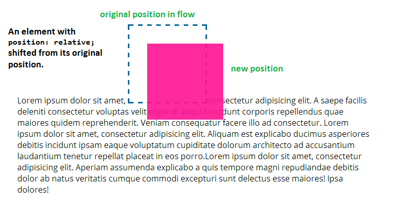
position: relative to it. The dashed square shows the original position of the element in the page flow. The element is moved 35px to the bottom and 35px to the right, relative to its original position.
A relatively positioned element that is shifted from its original position keeps its original position in the page flow as if it hadn’t been moved, and any new position it takes does not affect the flow of content on the page. It can easily overlap other elements on the page.
The above image shows how the element’s original position is preserved even after the element has been moved. It also shows the element overlapping other elements on the page and not affecting their flow by its repositioning.
When an element is positioned absolutely (position: absolute;), it can be positioned relative to another element on the page. The element relative to which it is positioned should have a positioning context established on it, that is to be used for positioning your element.
A positioning context can be established on an element by settings its position to relative. So, according to what we mentioned before, an absolutely positioned element is positioned relative to a relatively positioned element (that has position: relative set on it). The origin of the coordinate system is the relatively positioned element’s top left corner.
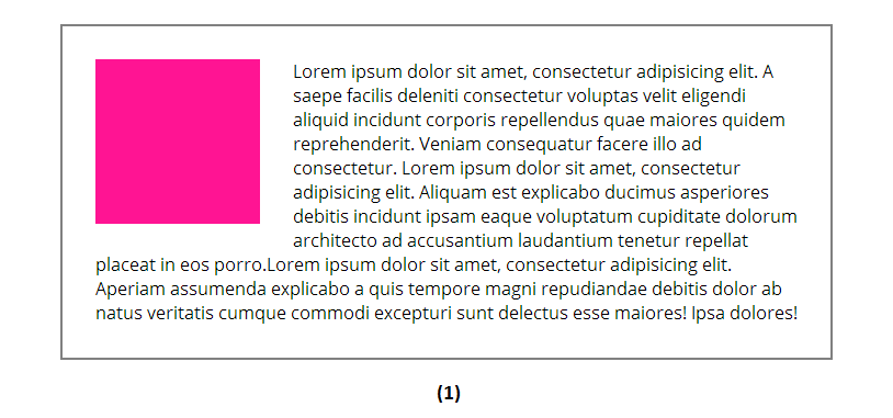
For example, the following image (1) shows an element that is positioned statically and how the content around it flows normally. The pink square in this case is floated to the left so that the text wraps around its side.
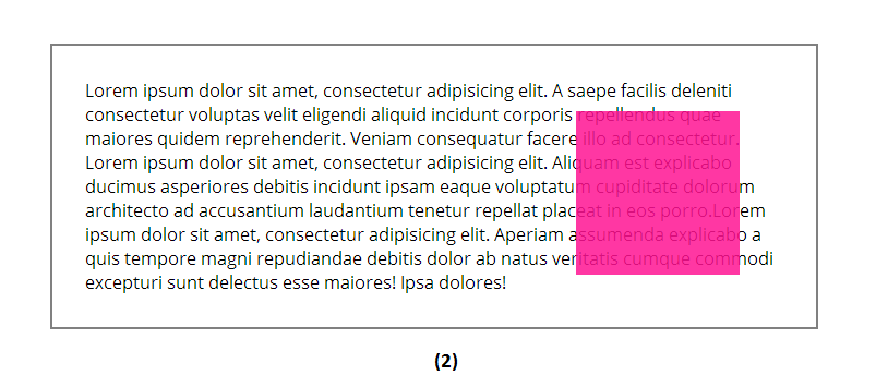
The grey outline shows the border of the pink square’s container. A position: relative has been set on the container so that it establishes a positioning context for the pink square, which we’re going to position absolutely. Once the pink square is positioned absolutely, it is removed from the flow of the page and the text flows as if the square never existed in the flow (2).
top: 30px and right: 40px.If an element is positioned absolutely and none of its predecessors have a positioning context, it is positioned relative to the viewport.
An element with a fixed position (position: fixed) is positioned relative to the viewport. It has the same behavior as the absolutely positioned elements: it is removed from the flow of the page and does not affect the layout anymore. But instead of being positioned relative to some element on the page, it is positioned relative to the viewport and is not affected by scrolling—scrolling down will not make the element scroll up, it is fixed within the area of the viewport, in the position set using the offset properties.
Fixed positioning is usually used to keep certain elements in view at all times, like, for example, a fixed header and navigation, or an overlay window.
Sticky, center and page positioning are still experimental with low or no support at this time.
An element with a sticky position (position: sticky) is treated as a hybrid of relative and fixed elements. The element is treated as a relatively positioned element until it reaches a certain scrolling point, after which it is treated as a fixed element. For example:
.element {
    position: sticky;
    top: 70px;
}
The above element will behave just like it had a relative position until the viewport reaches a scrolling point where the element is 10px from the top of the viewport. Once the element is less than 70px from the top, it is fixed to 70px from the top until the browser scrolls back up above that threshold.
The sticky effect is usually created using JavaScript, and once the sticky value is supported, it will be possible to create using CSS.
One thing to note here is that you need to specify a “threshold” for a sticky element using one of the offset properties, otherwise it won’t work, and it will behave exactly as if it were had position relative.
Position center is used to, as the name suggests, center an element inside another element. The centered element will be positioned at the center of its containing block, and, just like absolutely positioned elements, is taken out of the normal flow of the page. Then, the offset properties can be used to shift the elements from its centered position in any of the four directions.
The page position value’s behavior is still unclear at this time. It is related to paged media and/or containing blocks created using CSS Regions.
Trivia & Notes
Absolutely positioned elements using offset properties may have margins, these margins are positioned inside the positioning context.
An absolutely positioned element will take up as much horizontal and vertical space as its content needs. You can stretch an absolutely positioned element and have it fill the width of its container by leaving its width unspecified and positioning its left edge on its parent’s left edge and its right edge on its parent’s right edge, using the right and left offset properties:
position: absolute;
left: 0;
right: 0;
Similarly, an absolutely positioned element can be stretched vertically using top and bottom offset properties, and leaving height unspecified.
position: absolute;
top: 0;
bottom: 0;
In case where the height and width of an absolutely positioned element are indeed specified, then:
- If both
topandbottomare specified,topwins. - If both
rightandleftare specified,leftwins ifdirectionisltr(e.g. English), andrightwins ifdirectionisrtl(e.g. Arabic).
Fixed elements are usually positioned relative to the viewport. No matter where you put a fixed element, it’ll get a fixed position with respect to the viewport, unless you’re transforming one of the overlay’s ancestors, in which case the transformed element creates a containing block for all its positioned descendants, even those that are getting a fixed position. You can read more about this in this excellent article by Eric Meyer.
Official Syntax
-
Syntax:
position: static | relative | absolute | sticky | center | page | fixed
- Initial: static
- Applies To: all elements
- Animatable: no
Values
- static
-
The default positioning algorithm. The box is a normal box, laid out according to the normal flow. The
top,right,bottom, andleftproperties do not apply. - relative
-
The box’s position is calculated according to the normal flow (this is called the position in normal flow). Then the box is offset relative to its normal position and in all cases, including table elements, does not affect the position of any following elements.
The effect of
position: relativeon table elements is defined as follows:- table-row-group, table-header-group, table-footer-group and table-row offset relative to its normal position within the table. If table-cells span multiple rows, only the cells originating in the relative positioned row is offset.
- table-column-group, table-column do not offset the respective column and has no visual affect when
position: relativeis applied. - table-caption and table-cell offset relative to its normal position within the table. If a table cell spans multiple columns or rows the full spanned cell is offset.
- absolute
-
The box’s position (and possibly size) is specified with the
top,right,bottom, andleftproperties. These properties specify offsets with respect to the box’s containing block. Absolutely positioned boxes are taken out of the normal flow. This means they have no impact on the layout of later siblings. Though absolutely positioned boxes may have margins, those margins do not collapse with any other margins (Seemarginfor more). - sticky
-
The box’s position is calculated according to the normal flow (as if it has
position: relative). Then the box is offset and fixed relative to the viewport and containing block and in all cases, including table elements, does not affect the position of any following elements. When an element is stickily positioned, the position of the following element is calculated as though if the element were not offset.The effect of
position: stickyon table elements is the same as forposition: relative. - center
-
The box’s position (and possibly size) is specified with the
top,right,bottom, andleftproperties. The box is vertically and horizontally centered within its containing block and these properties specify offsets with respect to the box’s centered position within its containing block. Center positioned boxes are taken out of the normal flow. This means they have no impact on the layout of later siblings (likeabsolute). Though center positioned elements may have margins, those margins do not collapse with any other margins. - page
-
The box’s position is calculated according to the
absolutemodel.- In the case of paged media or when inside a region box the box’s containing block is always the initial containing block.
- Otherwise, the containing block is determined per the “absolute” model.
As with the
absolutemodel, the box’s margins do not collapse with any other margins
Examples
.parent {
    position: relative;
}

.child {
    position: absolute;
    top: 10px;
    left: 30px;
}

/* The header is fixed in view as the viewport scrolls */
header {
    position: fixed;
    top: 0;
    left: 0;
    right: 0;
}

/* This element becomes fixed once its position from the viewport"s top is <= 100px */
.sticky {
    position: sticky;
    top: 100px;
}
Live Demo
The following demo contains demonstrations of the four main positioning values: relative, absolute, fixed, and even sticky. Check the browser support section below for information on whether your browser supports position: sticky and/or how to enable it to see the heading get sticky on scroll.
Browser Support
The position property works in all major browsers: Chrome, Firefox, Safari, Opera, Internet Explorer, and on Android and iOS.
However, support for fixed and sticky values differs among browsers. Here are the compatibility tables for these two values:
CSS position:fixed
Method of keeping an element in a fixed location regardless of scroll position
W3C Recommendation
Supported from the following versions:
Desktop
- 4
- 2
- 7
- 9
- 3.1
Mobile / Tablet
- 8
- 3
- No
- 66
- 60
In Internet Explorer, fixed positioning doesn’t work if the document is in quirks mode.
CSS position:sticky
Keeps elements positioned as "fixed" or "relative" depending on how it appears in the viewport. As a result the element is "stuck" when necessary while scrolling.
W3C Working Draft
Supported from the following versions:
Desktop
- 56
- 59
- No
- 42
- 7.1*
Mobile / Tablet
- 8*
- 66
- No
- 66
- 60
Sticky positioning will only work in Firefox 26 (Gecko 26) if the about:config preference layout.css.sticky.enabled is set to true.
The center and page values are currently not supported in any browser.
Gecko Notes from MDN:
In Gecko, if you have a positioned <table> element inside a positioned block element, such as a <div>, a position: absolute; styled element inside the table would be positioned relative to the outer <div> rather than the table, which is the nearest positioned ancestor. This is a bug, and has not been fixed.
A position: absolute styled element within a positioned <div> element that has a display: table-cell style will become positioned relative to an outer block element instead of the containing <div>, similar to the behavior noted above.