transform
The transform property allows you to visually transform an element in two-dimensional or three-dimensional space.
Using transform, elements can be translated, rotated and/or scaled in two or three dimensional space.
More specifically, the transform property transforms the coordinate system of an element, thus resulting in the element’s transformation in space.
The transform property takes as a value a list of transform functions (see Values section below) or none. The coordinate system of the transformed element is transformed by a final transformation value that is obtained by converting each function in the list to its corresponding matrix, and then multiplying those matrices.
Any value for transform other than none results in the creation of both a stacking context and a containing block. This means that the transformed element acts as a containing block for fixed positioned descendants.
The transformation matrix that is used to apply the transformations to an element is also affected by the value of the transform-origin property which, as its name suggests, is used to specify the origin of the transformations—that origin is the origin of the element’s coordinate system at the time of transformation.
The Coordinate System
Every element in CSS has a coordinate system whose origin is at the top left corner of the element—this is known as the initial coordinate system.
When you use transform, the origin of the coordinate system is moved to the center of the element. This is because the transform-origin property’s default value is 50% 50%, which translates the origin to the center of the element. After that, all transformations are applied to the element based on the new position of the coordinate system.

transform-origin value.
You can specify where you want to move the origin using the transform-origin property, if you don’t want the origin to be moved to the center. Different transform origins are useful depending on the transformation effect you want. See the transform-origin property entry for more examples and use cases.
If you rotate or skew the element using the transform property, you transform and/or skew its entire coordinate system along with it, and all consequent transformations will be applied based on the new coordinate system’s transformation. This is why the order of transformations is very important—different orders will result in different transformations. This makes sense considering that the transformations are translated into matrices, and multiplying two matrices in mathematics will give different results depending on the order of these matrices. For example, a x b will not result in the same result as b x a (unless one of them is the identity matrix).
For example, if you want to translate an element and rotate it in its new position, you should do it in the mentioned order: translate and then rotate. If you were to rotate an element first, then its coordinate system will be rotated too, and then translating in a certain direction may not result in the result you’d expect. If you were to rotate an element by 90 degrees around the y-axis, for example, then its x-axis will point towards the inside of the screen, away from you, so if you apply a translation then along the x-axis, the element will not move to the right, it will move inwards away from you. So, it is important to look out for the order in which you write the transform functions in the transform property—the first function will be applied first, and the last function will be applied last. It helps to visualize the coordinate system in your mind all the time to make sure you’re not missing this point.
Trivia & Notes
Transformations applied to an element do affect the visual rendering, but have no effect on the CSS layout other than affecting overflow. This means that whatever space the element takes up before you transform it, it will still take up after you transform it, and the transformations will have no effect on how the elements around the transformed element flow. The transform property does not affect the flow of the content surrounding the transformed element. However, the extent of the overflow area takes into account transformed elements. This behavior is similar to what happens when elements are offset via relative positioning. Therefore, if the value of the overflow property is scroll or auto, scrollbars will appear as needed to see content that is transformed outside the visible area.
While some values of the transform property allow an element to be transformed in a three-dimensional coordinate system, the elements themselves are not three-dimensional objects. Instead, they exist on a two-dimensional plane (a flat surface) and have no depth.
When an element is transformed, a value of fixed for the background-attachment property is treated as if it had a value of scroll. The computed value of background-attachment is not affected.
In addition to the transform-origin property’s role in CSS transforms, the perspective and perspective-origin properties can be used to add a feeling of depth to a scene, and the transform-style property is used to preserve the three-dimensional space in an element; this is useful when you’re nesting CSS transforms. All these properties are usually used in conjunction with each other to create CSS transformations in two or three dimensions. You can read more about each of these properties in their respective entries.
Official Syntax
-
Syntax:
transform: none | <transform-list>
- Initial: none
- Applies To: transformable elements
- Animatable: yes
Notes
A <transform-list> is a list of one or more transform functions. These functions are described in the Values section below.
Values
You can apply a transformation to an element using one of the following transform property values:
translate()translateX()translateY()scale()scaleX()scaleY()rotate()skew()skewXskewYmatrix()translateZtranslate3d()scaleZ()scale3d()rotateX()rotateY()rotateZ()rotate3d()matrix3d()perspective()
Some of these functions are used to apply two-dimensional transformations, others are used to apply three-dimensional transformations.
2D Transform Functions:
- translate()
-
transform: translate( tx [, ty ]? ); /* the question mark indicates the second value is optional */The
translate()function is used to translate the element by a vector [tx, ty], where tx is the translation along the x-axis, and ty is the translation along the y-axis. If ty is not provided, it is considered zero and the element is translated along the x-axis only. The values tx and ty are provided either as a<length>or as apercentage. Not including a unit type will cause the number to be interpreted as a “user unit”.Positive translation values will move the element along the positive direction of the axis, and negative values will move it in the opposite direction.
Examples:
transform: translate(100px); /* translates the element by 100px on the x-axis */
transform: translate(-100px); /* translates the element by 100px on the x-axis */
transform: translate(50px, 300px); /* translates the element 50px to the right and 300px downwards */
transform: translate(50%, 10%); /* translates the element by 50% of its width to the left, and 10% of its height to the bottom */
transform: translate(-100%); /* translates the element -100% to the left */
transform: translate(100px, 100px); /* see the result in the following image */
The result of applying a translation to an element:

The result of applying transform: translate(100px, 100px);to an element. Notice the position of the transform origin. - translateX()
-
transform: translateX(tx);The
translateX()function is used to translate an element by the given amount along the x-axis. The value tx is provided either as a<length>or as apercentage. Not including a unit type will cause the number to be interpreted as a “user unit”.Positive translation values will move the element along the positive direction of the x-axis, and negative values will move it in the opposite direction.
Examples:
transform: translateX(300px); transform: translateX(-50%); transform: translateX(150%); - translateY()
-
transform: translateY(ty);The
translateY()function is used to translate an element by the given amount along the x-axis. The value ty is provided either as a<length>or as apercentage. Not including a unit type will cause the number to be interpreted as a “user unit”.Positive translation values will move the element along the positive direction of the y-axis, and negative values will move it in the opposite direction.
Examples:
transform: translateY(300px); transform: translateY(-50%); transform: translateY(150%); - scale()
-
transform: scale(<number> [, <number>]?); /* the question mark indicates the second value is optional */The
scale()function is used to scale an element up or down, making it appear bigger or smaller. It takes one or two unitless<number>s as a value, sx and sy, where sx will scale the element in the direction of the x-axis, and sy will scale it in the direction of the y-axis direction. If only one value (sx) is provided, the second one (sy) is assumed to be equal to the first one.If the value provided is greater than one, the element is scaled up—it will look bigger in the corresponding direction. If the value is equal to one, the element stays unchanged (in the corresponding direction). If the value is between zero and one exclusively, the element is scaled down. If the value is zero, the element disappears. Negative values are allowed, but they don’t scale the element. In fact, they cause the transformed element to be flipped in either direction!
Examples:
transform: scale(1, 1); /* element is unchanged */
transform: scale(2, 2); /* element looks twice as its original size */
transform: scale(1, 2); /* element is scaled only vertically by double its vertical size, and its horizontal size is unchanged. Similar effect to that of scaleY(2) (see next value) */
transform: scale(2, 1); /* element is scaled only horizontally by double its horizontal size, and its vertical size is unchanged. Similar effect to that of scaleX(2) (see next value) */
transform: scale(3); /* scales element to 3 times its size */
transform: scale(0.5); /* element is scaled to look half its size */
transform: scale(0); /* element is scaled out so that it disappears */
transform: scale(-1); /* will flip the element in both directions */
The following image shows the result of applying different
scale()transformations to an image. The first one on the left is the image with no transformation. The second one is the result of applyingtransform: scale(2);, the third one is the result of applyingtransform: scale(0.5), and the fourth one is the result of applyingtransform: scale(0.5, 1.5);. Notice how the images overlap each other because the transformation on each one does not affect the flow of content around it.
The result of applying different scale()transformations to an image. The first one on the left is the image with no transformation. The second one is the result of applyingtransform: scale(2);, the third one is the result of applyingtransform: scale(0.5), and the fourth one is the result of applyingtransform: scale(0.5, 1.5);.The following image is the result of applying
scale()(and its two variations) with a negative value on an image: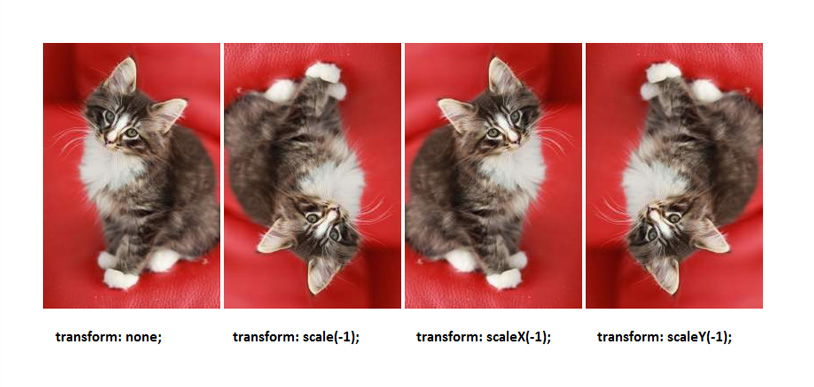
Image showing the result of applying the scale() functions with negative values on an image. - scaleX()
-
transform: scaleX(<number>);The
scaleX()function is used to scale an element up or down, making it appear bigger or smaller, in the direction of the x-axis. It takes a unitless<number>sx as a value, which is used to scale the element’s size along the x-axis.If the value provided is greater than one, the element is scaled up—it will look bigger along the x-axis. If the value is equal to one, the element stays unchanged in that direction. If the value is between zero and one exclusively, the element is scaled down along the x-axis. If the value is zero, the element disappears. Negative values are allowed, but they don’t scale the element. In fact, they cause the transformed element to be flipped horizontally (as if it were rotated along the y-axis)!
Examples:
transform: scaleX(2); /* scales the element to twice its size along the x-axis */
transform: scaleX(1); /* element is unchanged */
transform: scaleX(0.25); /* scales the element along the x-axis to quarter its size */
transform: scaleX(-1); /* flips the element along the x-axis */
See the
scale()value above to see how a negative value flips an element when applied usingscaleX(). - scaleY()
-
transform: scaleY(<number>);The
scaleY()function is used to scale an element up or down, making it appear bigger or smaller, in the direction of the y-axis. It takes a unitless<number>sy as a value, which is used to scale the element’s size along the y-axis.If the value provided is greater than one, the element is scaled up—it will look bigger along the y-axis. If the value is equal to one, the element stays unchanged in that direction. If the value is between zero and one exclusively, the element is scaled down along the y-axis. If the value is zero, the element disappears. Negative values are allowed, but they don’t scale the element. In fact, they cause the transformed element to be flipped vertically (as if it were rotated along the x-axis)!
Examples:
transform: scaleY(2); /* scales the element to twice its size along the y-axis */
transform: scaleY(1); /* element is unchanged */
transform: scaleY(0.25); /* scales the element along the y-axis to quarter its size */
transform: scaleY(-1); /* flips the element along the y-axis */
See the
scale()value above to see how a negative value flips an element when applied usingscaleY(). - rotate()
-
transform: rotate(<angle>);The
rotate()function is used to rotate an element in the two-dimensional space. The element is rotated by an angle which is passed to the function as an<angle>value. The element is rotated about the origin as defined by thetransform-originproperty.A positive value will rotate the element in the clockwise direction. A negative value will rotate it in the counter-clockwise direction.
Examples:
transform: rotate(45deg);
transform: rotate(-60deg);
transform: rotate(1.5rad);
transform: rotate(1turn);
The following image shows the result of applying a positive and then a negative rotation value to an image. Notice how the images overlap each other because the transformation on each one does not affect the flow of content around it.

The result of applying no rotation, a positive rotation, and a negative rotation on an image. The positive rotate()function rotates the image in the clockwise direction, while the negative value rotates it in the counter-clockwise direction. - skew()
-
transform: skew(<angle> [, <angle>]?);The
skew()function is used to skew an element. Skewing an element is like applying a tilting effect on it. It is like grabbing two opposite vertices of a rectangle and then pulling them in opposite directions, turning the rectangle into a parallelogram.It takes either one or two arguments: ax and ay. Both are
anglevalues. The first value (ax) skews the element along the x-axis, and the second argument (ay) skews it along the y-axis. Skewing along the x-axis is like pulling the rectangle angles to the sides, and skewing along the y-axis is like pulling them vertically in opposite directions. The two angle values determine the amount by which the element is skewed. If the second value is not provided, it is assumed to be zero.The skew() function was present in early drafts. It has been removed but is still present in some implementations. *Do not use it*. In order to skew an element in either direction, use the
skewX()andskewY()functions listed below. Also note that the behavior ofskew()is different from multiplyingskewX()withskewY(). - skewX()
-
transform: skewX(<angle>);The
skewX()function is used to skew an element. Skewing an element is like applying a tilting effect on it. In the case ofskewX(), it is like grabbing two opposite vertices of a rectangle and then pulling them along the x-axis in opposite directions, turning the rectangle into a parallelogram.It takes an
angleax as a value. The element is skewed by the value of the angle. You can imagine two opposite vertices (say the upper left and bottom right, for example) being pulled in opposite directions (the upper left pulled to the left and the bottom right to the right) until the inner value of these vertices becomes 90deg – ax.If the angle value is positive, the upper left and bottom right corners of the rectangle are “pulled”. If the value is negative, the upper right and bottom left angles are pulled. An angle value of 90deg (or -90deg) will make the element disappear. A value of 180deg (or -180deg) will leave it unchanged.
Examples:
transform: skewX(30deg);
transform: skewX(-30deg);
transform: skewX(-0.5rad);
transform: skewX(-1turn);
transform: skewX(-90deg);
The following image shows the result of applying
skewX()to an image using a positive angle and then a negative angle of the same value.
The result of applying skewX()to an image using a positive angle and then a negative angle of the same value.Remember that skewing an element will also skew its coordinate system with it. Therefore, after applying a skew transformation to your element, you need to be aware that you’re not left with an orthogonal coordinate system anymore. When the coordinate system is skewed, consequent transformations may result in unexpected results if you don’t calculate them based on the new coordinate system. You can read more about coordinate systems in CSS and SVG here.
- skewY()
-
transform: skewY(<angle>);The
skewY()function is used to skew an element. Skewing an element is like applying a tilting effect on it. In the case ofskewY(), it is like grabbing two opposite vertices of a rectangle and then pulling them along the y-axis in opposite directions, turning the rectangle into a parallelogram.It takes an
angleay as a value. The element is skewed by the value of the angle. You can imagine two opposite vertices (say the upper left and bottom right, for example) being pulled in opposite directions (the upper left pulled up and the bottom right to the bottom) until the inner value of these vertices becomes 90deg – ax.If the angle value is positive, the upper left and bottom right corners of the rectangle are “pulled”. If the value is negative, the upper right and bottom left angles are pulled. An angle value of 90deg (or -90deg) will make the element disappear. A value of 180deg (or -180deg) will leave it unchanged.
Examples:
transform: skewY(30deg);
transform: skewY(-30deg);
transform: skewY(-0.5rad);
transform: skewY(-1turn);
transform: skewY(-90deg);
The following image shows the result of applying
skewY()to an image using a positive angle and then a negative angle of the same value.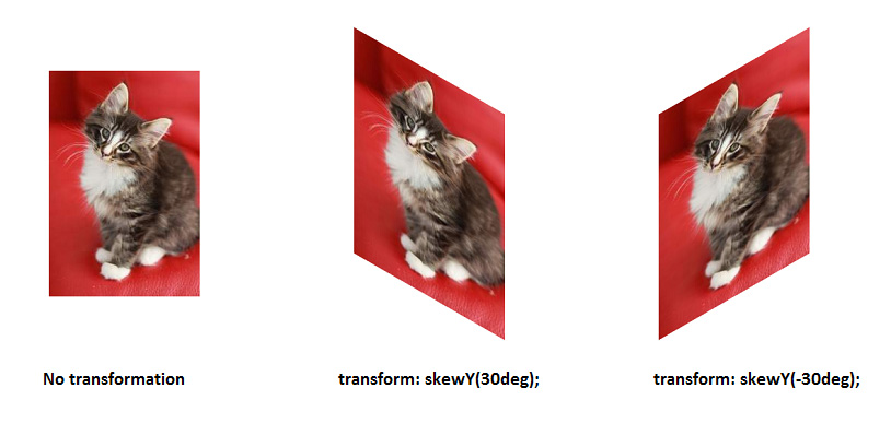
The result of applying skewY()to an image using a positive angle and then a negative angle of the same value.Remember that skewing an element will also skew its coordinate system with it. Therefore, after applying a skew transformation to your element, you need to be aware that you’re not left with an orthogonal coordinate system anymore. When the coordinate system is skewed, consequent transformations may result in unexpected results if you don’t calculate them based on the new coordinate system. You can read more about coordinate systems in CSS and SVG here.
- matrix()
-
transform: matrix( <number> [, <number> ]{5,5} )The
matrix()function is used to specify a two-dimensional transformation matrix. It can be used to combine several transformations into one. For example, instead of using two (or more) transform functions (see above) in one declaration like so:transform: rotate(45deg) translate(24px,25px);Using the
matrix()function, we can combine these two transformations into one matrix:transform: matrix(0.7071067811865476, 0.7071067811865475, -0.7071067811865475, 0.7071067811865476, -0.7071067811865426, 34.648232278140824);As you can see, calculating the values of the
matrix()function wouldn’t be easy if you’re not math-savvy. These calculations were also probably not meant to be done by hand. Luckily, Eric Meyer and Aaron Gustafson created a very useful tool which can do the calculations for you—all you do is enter the transformations you want and the click the red button for the tool to generate the equivalentmatrix()function for you.
3D Transform Functions:
In addition to the two-dimensional transformation functions, you can apply three-dimensional transformations using the three-dimensional variations of the two-dimensional functions.
- translateZ()
-
transform: translateZ(tz);The
translateZ()function is used to translate an element by the given amount along the z-axis. The value tz is provided as a<length>(percentages are not valid here). Not including a unit type will cause the number to be interpreted as a “user unit”.Positive translation values will move the element along the positive direction of the z-axis, and negative values will move it in the opposite direction.
Examples:
transform: translateZ(300px); transform: translateZ(-5em); transform: translateZ(4vh); - translate3d()
-
transform: translate3d( tx , ty, tz);The
translate3d()function is the three-dimensional equivalent of thetranslate()function. It is used to translate the element by a vector [tx, ty, tz], where tx is the translation along the x-axis, ty is the translation along the y-axis, and tz is the translation along the z-axis. The values tx and ty are provided either as a<length>or as apercentage. The tx value needs to be a<length>and cannot be defined as percentage. Not including a unit type will cause the number to be interpreted as a “user unit”.Positive translation values will move the element along the positive direction of the axis, and negative values will move it in the opposite direction.
Examples:
transform: translate3d(100px, 100px, -200px); transform: translate3d(50%, -100%, 1em); transform: translate3d(-100px, -30px, 5vw); - scaleZ()
-
transform: scaleZ(<number>);The
scaleZ()is used to scale an element in the third dimension, along the z-axis. It takes a unitless<number>sz as a value, which is used to scale the element’s size in the corresponding direction.Examples:
transform: scaleZ(2);
transform: scaleZ(1); /* element is unchanged */
transform: scaleZ(0.25);
transform: scaleZ(-1);
Since all elements in CSS are two-dimensional, you might wonder how the
scaleZ()would actually scale the element if an element in CSS does not have a “thickness”.As a matter of fact,
scaleZ()actually scales the element along the z-axis. Practically, it’s kind of like the z-axis itself is scaled, and then the position of the element on the z-axis will automatically be affected by the scale operation on the axis.The effect of
scaleZis more obvious when you have an element with aperspectiveset, and that is rotated in three-dimensional space, or translated along the z-axis. So, we’ll go over a couple of examples.In the first example, we have two elements that are positioned in three-dimensional space, and are translated along the z-axis using the
translateZ()function. Both elements are translated by the same distance. Then, we’re going to scale the second element (the one on the right) usingscaleZ(2). The following image shows the result of applying these transformations and the difference between the two elements after scaling the second one withscaleZ. Notice how the second element looks bigger, because its position on the z-axis has been scaled as the z-axis is scaled—it looks closer to you and hence bigger, but the actual dimensions (width and height) are unchanged.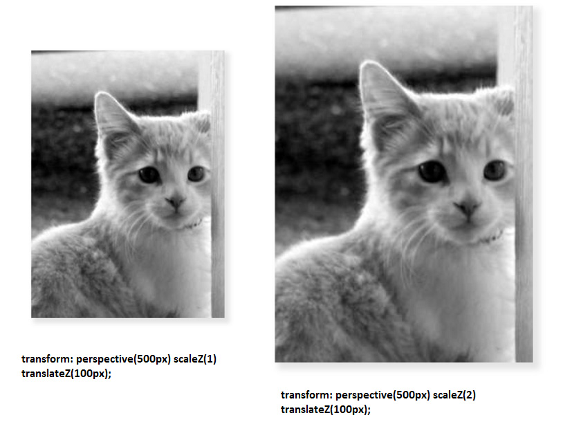
The result of applying the same transformations to two elements, but with the difference of scaling the second element on the right using the scaleZ()function.Another example where you can see the effect of
scaleZis when two elements are also transformed the same way, except that instead of translating them in three-dimensional space, they are rotated about the x-axis usingrotateX. The second element (on the right) has been scaled along the z-axis using thescaleZ()function. Notice how it looks closer to you and thus bigger.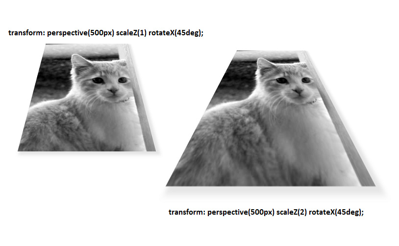
The result of applying the same transformations to two elements, but with the difference of scaling the second element on the right using the scaleZ()function.Note that you have to keep the same order of transformations between the two elements to actually see the effect of
scaleZbecause, as mentioned earlier, the order of transformations matters and different orders will result in different transformations. - scale3d()
-
transform: scale3d(<number>, <number>, <number>);The
scale3d()function is the three-dimensional equivalent of thescale()function. It is used to scale an element up or down, making it appear bigger or smaller. It takes three unitless<number>s as a value, sx, sy, and sz, where sx will scale the element in the direction of the x-asix, sy will scale it in the direction of the y-axis, and sz will scale it in the direction of the z-axis.If the value provided is greater than one, the element is scaled up and it will look bigger in the corresponding direction. If the value is equal to one, the element stays unchanged (in the corresponding direction). If the value is between zero and one exclusively, the element is scaled down. If the value is zero, the element disappears. Negative values are allowed, but they don’t scale the element. In fact, negative sx and sy values cause the transformed element to be flipped in either direction! See the
scale()section above for examples.Examples:
transform: scale3d(1, 1, 1); /* element is unchanged */ transform: scale3d(2, 2, 2); /* element looks twice as its original size */ transform: scale3d(1, 2, 0); transform: scale3d(2, 1, 3); transform: scale3d(-1, -1, -1); - rotate3d()
-
transform: rotate3d( <number> , <number> , <number> , <angle> );The
rotate3d()function is the three-dimensional equivalent of therotate()function. It is used to rotate an element in three-dimensional space. The element is rotated by an<angle>which is passed in as the fourth parameter of the function. The first three parameters specify the rotation direction, and together they form a direction vector [x, y, z] which is used to apply the rotation in the specified direction.A positive angle value will rotate the element in the clockwise direction along the corresponding axis, and a negative value will rotate it in the counter-clockwise direction along that axis.
The clockwise direction is determined by looking at the vector starting from the end of the vector (where the pointing arrow usually is) towards the origin. The following image shows the positive (clockwise) direction of rotation along the three axes:
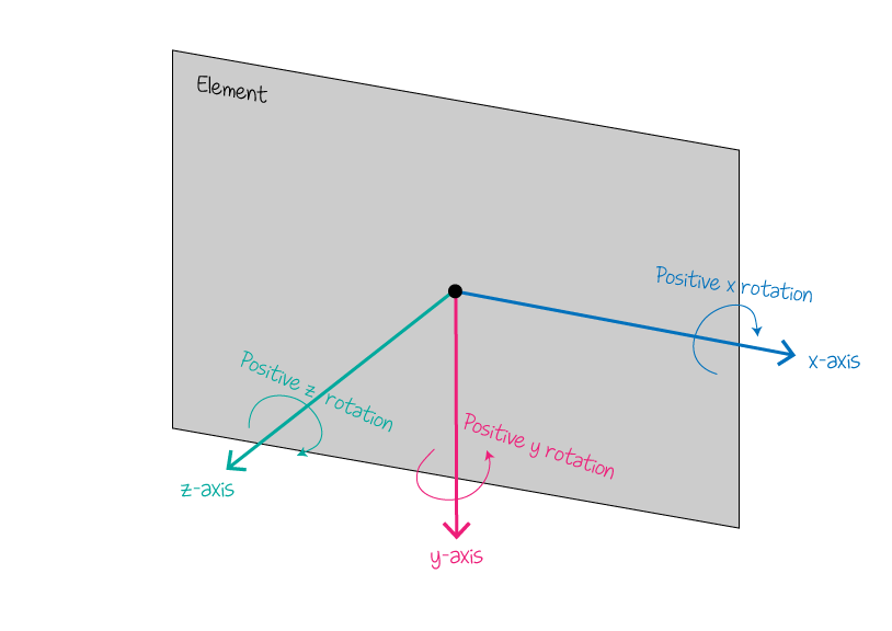
The positive direction of rotation along the three axes. Notice how if you stand at the end of each vector and look towards the origin, the clockwise rotation matches the one shown in the image. The first three parameters of
rotate3d()will specify the direction vector along which the rotation will happen, and the angle will specify the direction: clockwise along the vector or counter-clockwise.Examples:
transform: rotate3d(1, 1, 2, 45deg);
transform: rotate3d(2, 1, 3, 33deg);
transform: rotate3d(1, 0, 0, 45deg); /* element is rotated clockwise along the x-axis by 45deg */
transform: rotate3d(0, 1, 0, 45deg); /* element is rotated clockwise along the y-axis by 45deg */
transform: rotate3d(0, 0, 1, 45deg); /* element is rotated clockwise along the z-axis by 45deg */
transform: rotate3d(0, 0, 0, 50deg); /* NO ROTATION IS APPLIED */
The following image shows the result of applying
rotate3d(1, 1, 1, 50deg);to an image:
The result of applying rotate3d(1, 1, 1, 50deg);to an image - rotateX()
-
transform: rotateX(<angle>);The
rotateX()function is used to rotate an element about the x-axis in three-dimensional space. It is equivalent to:transform: rotate3d(1, 0, 0, <angle>);Where
rotate3d()is the transformation function used to rotate an element in three-dimensional space.It takes an
<angle>as a value. The element is rotated then by the specified value about the x-axis. If the value is positive, the element is rotated in a clockwise direction, if it is negative it is rotated in a counter-clockwise direction. The clockwise direction is determined by looking at the x-axis starting from the end (where the pointing arrow usually is) towards the origin. See therotate3d()section above for a visual representation of the clockwise direction along the x-axis.Examples:
transform: rotateX(30deg);
transform: rotateX(-135deg);
transform: rotateX(90deg);
The following image shows the result of applying
rotateX(50deg)androtateX(-50deg)on an image: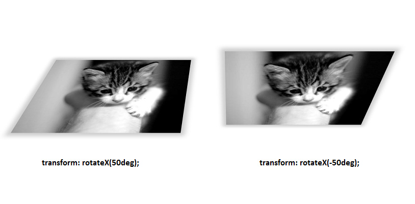
The result of applying rotateX(50deg)androtateX(-50deg)on an image - rotateY()
-
transform: rotateY(<angle>);The
rotateY()function is used to rotate an element about the y-axis in three-dimensional space. It is equivalent to:transform: rotate3d(0, 1, 0, <angle>);Where
rotate3d()is the transformation function used to rotate an element in three-dimensional space.It takes an
<angle>as a value. The element is rotated then by the specified value about the y-axis. If the value is positive, the element is rotated in a clockwise direction, if it is negative it is rotated in a counter-clockwise direction. The clockwise direction is determined by looking at the x-axis starting from the end (where the pointing arrow usually is) towards the origin. See therotate3d()section above for a visual representation of the clockwise direction along the x-axis.Examples:
transform: rotateY(30deg);
transform: rotateY(-135deg);
transform: rotateY(90deg);
The following image shows the result of applying
rotateY(50deg)androtateY(-50deg)on an image:
The result of applying rotateY(50deg)androtateY(-50deg)on an image - rotateZ()
-
transform: rotateZ(<angle>);The
rotateZ()function is used to rotate an element about the z-axis in three-dimensional space. It is equivalent to:transform: rotate3d(0, 0, 1, <angle>);Where
rotate3d()is the transformation function used to rotate an element in three-dimensional space.It takes an
<angle>as a value. The element is rotated then by the specified value about the z-axis. If the value is positive, the element is rotated in a clockwise direction, if it is negative it is rotated in a counter-clockwise direction. The clockwise direction is determined by looking at the x-axis starting from the end (where the pointing arrow usually is) towards the origin. See therotate3d()section above for a visual representation of the clockwise direction along the x-axis.Examples:
transform: rotateZ(30deg);
transform: rotateZ(-135deg);
transform: rotateZ(90deg);
The following image shows the result of applying
rotateZ(50deg)androtateZ(-50deg)on an image:
The result of applying rotateZ(50deg)androtateZ(-50deg)on an image - matrix3d()
-
transform: matrix3d( <number> [, <number> ]{15,15} );The
matrix3d()function is the three-dimensional equivalent of thematrix()function. Just like thematrix()function,matrix3d()is used to combine transformations into one transformation matrix. It is used to describe a sequence of three-dimensional transforms in a 4×4 grid.
For example, instead of using two or more transform functions in one declaration like so:transform: rotate3d(1, 0, 1, 45deg) translate3d(24px,25px, 100px);Using the
matrix3d()function, we can combine these two transformations into one matrix:transform: matrix3d(0.8535533905932737, 0.4999999999999999, 0.14644660940672619, 0, -0.4999999999999999, 0.7071067811865476, 0.4999999999999999, 0, 0.14644660940672619, -0.4999999999999999, 0.8535533905932737, 0, 22.62994231491119, -20.3223304703363, 101.3700576850888, 1)As you can see, calculating the values of the
matrix3d()function wouldn’t be easy if you’re not math-savvy. These calculations were also probably not meant to be done by hand. Luckily, Eric Meyer and Aaron Gustafson created a very useful tool which can do the calculations for you—all you do is enter the transformations you want and the click the red button for the tool to generate the equivalentmatrix()function for you. - perspective()
-
transform: perspective(<length>)The technical explanation:
The
perspective()function specifies a perspective projection matrix. This matrix scales points in X and Y based on their Z value, scaling points with positive Z values away from the origin, and those with negative Z values towards the origin. Points on the z=0 plane are unchanged. The<length>parameter passed to it represents the distance of the z=0 plane from the viewer. Lower values give a more flattened pyramid and therefore a more pronounced perspective effect. For example, a value of 1000px gives a moderate amount of foreshortening and a value of 200px gives an extreme amount. The value for depth must be greater than zero, otherwise the function is invalid.
The blue circle in this image represents an element in three-dimensional space. The letter d represents the value of the perspective, which is the assumed distance between the viewer’s eye and the screen. The letter Z represents the position of the element on the z-axis. The farther the element is on the z-axis, the smaller is looks relative to the viewer, and the closer it is, the bigger it looks. This is the effect of the perspective in three-dimensional space. In other words…
The
perspective()function is used to give an element depth by making an element higher on the z-axis (closer to the viewer) appear larger, and an element further away to appear smaller. The smaller the value, the closer the z-pane is from the viewer, and the more impressive the effect; the higher the value, the farther the element is from the screen and the more subtle the effect is.The
perspective()function is used to activate the three-dimensional space when you’re applying a three-dimensional transformation on an element using any of the above listed functions. Specifying a perspective is important, otherwise the three-dimensional effect will look flattened and two-dimensional.A perspective can be applied using the
perspective()function, or using theperspectiveproperty. There is a major difference between these two, but the one to note at this point is that theperspective()function is applied to an element that is being transformed in 3D space, while theperspectiveproperty is applied to an element whose descendants are being transformed in 3D space. There are other differences between the perspective function and the property, you can read more about these differences in theperspectiveproperty entry. In this entry, we’ll focus on usingperspective()on an element transformed in three-dimensional space, with no perspective defined on its container.For example, If you were to rotate an element around the y-axis using the
rotateY()function, you need to specify a perspective in order to create a three-dimensional space for the three-dimensional transformations, otherwise the rotation will look flat and two-dimensional. The following image shows the difference between an image rotated in three-dimensional space with a perspective, and another one rotated without perspective.
Image showing the difference between an image rotated in three-dimensional space with a perspective, and another one rotated without perspective The
perspective()function takes a<length>value as a parameter. The smaller the value, the closer the z-pane is from the viewer, and the more impressive the effect; the higher the value, the farther the element is from the screen and the more subtle the effect is. The following image shows the result of applying differentperspective()values to an element.
Image showing the result of applying different perspective() values to an element If you have multiple elements transformed in three-dimensional space that also belong to the same container, it is recommended that you use the
perspectiveproperty on the parent instead of using theperspective()function on each individual element on its own, otherwise the overall effect may not be as you’d expect, because theperspective()function will result in each element having its own vanishing point, while applying theperspectiveproperty on the container will make sure all the elements inside it have the same vanishing point. You can read more about this in theperspectiveproperty entry, and in this article by Dave DeSandro.
Notes
An element can be translated using the CSS position property and its offset properties, but it is generally better to translate an element using the translate() function because it is hardware-accelerated, and therefore it is better for performance and to get smoother translations. The translate3d() function is also sometimes used to force hardware acceleration on elements in WebKit-based browsers to push CSS animations into it, because it leads to smoother animations.
Examples
The following example translates and element and rotates it and then scales it up. The transformations are two-dimensional, so no perspective is needed.
div {
    /* general styles here... */
    width: 100px;
    height: 100px;
    background-color: #0098D8;
    /* transformation */
    transform: translate(80px, 80px) rotate(45deg) scale(1.5, 1.5);
}
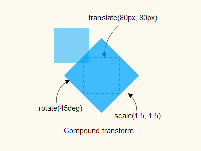
The following example applies a three-dimensional transformation on an element. The element will be rotated on the Y axis so that its front faces the right of the screen. It is also translated along the z-axis, which makes it move to the right of the screen. This is because the z-axis no longer points towards the viewer after the element is rotated on the y-axis—remember, rotating the element rotates its entire coordinate system with it.
In this example, the perspective is applied to the element using the perspective() function.
.element {
    /* ... */
    transform: perspective(800px) rotateY(90deg) translateZ(300px);
}
You can do the same transformation but instead of applying the perspective to the element, you can activate the 3D space in the container.
.parent {
    /* ... */
    perspective: 800px;
}
.child {
    /* ... */
    transform: rotateY(90deg) translateZ(300px);
}
Live Demo
Click on the element in the following demo to see it transform in three-dimensional space. The transformation effect is applied on click using JavaScript. Clicking on the element more than once will toggle the .transform class, which is contains the transformations. CSS transitions are used to make the transformation smooth.
Browser Support
The following is the support table for two-dimensional CSS transformations:
CSS3 2D Transforms
Method of transforming an element including rotating, scaling, etc. Includes support for `transform` as well as `transform-origin` properties.
W3C Working Draft
Supported from the following versions:
Desktop
- 36
- 16
- 10
- 12
- 9
Mobile / Tablet
- 9.0
- 66
- No
- 66
- 60
The following is the support table for three-dimensional CSS transformations:
CSS3 3D Transforms
Method of transforming an element in the third dimension using the `transform` property. Includes support for the `perspective` property to set the perspective in z-space and the `backface-visibility` property to toggle display of the reverse side of a 3D-transformed element.
W3C Working Draft
Supported from the following versions:
Desktop
- 36
- 16
- 10
- 23
- 9
Mobile / Tablet
- 9.0
- 66
- No
- 66
- 60
Further Reading
- CSS Transforms Module Level 1
- Intro To CSS 3D Transforms by David DeSandro