box-sizing
The box-sizing property is used to alter the way sizing of an element occurs with respect to its “box model”.
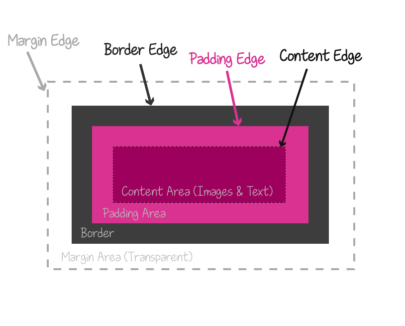
Every element has a box model that is composed of four boxes: the content box, the padding box, the border box, and the margin box.

Normally, when an element’s size is set, the width and height properties determine the width and height of the element’s content box. Any padding added to the element will increase the total computed width and/or height of the element—this is how the default box model works in regards to sizing the element.
Because this is how the box model sizing works in CSS, you may not always end up with the dimensions you want if you’re not aware of this.
For example, suppose you want your element to be 400px in width and 300px in height, so you start with the following:
.element {
    width: 400px;
    height: 300px;
}
And then you have some content that will go inside your element, like, for example, a textarea which will have text content written inside it, or any element with any kind of content, for that matter. Most of the times you would want your element to have inner space separating the content from the borders, so you add some padding to it:
.element {
    width: 400px;
    height: 300px;
    padding: 25px;
}
Now, because of the way the box sizing works in CSS, adding the padding to your element will add to its dimensions, since the width of the padding area will be added to the width of the content area, and so the total width (and height) of the element will increase. Your 400px by 300px element will be a 450px by 350px element.
Now suppose you also want to add a border to your element:
.element {
    width: 400px;
    height: 300px;
    padding: 25px;
    border: 5px solid black;
}
The width of the border also adds up to the width of the element and you’ll end up with a 460px by 360px element.
The box-sizing property allows you to control how the sizing of an element’s dimensions works.
Using the box-sizing property, you can tell the browser to include the padding width and/or border width in the width of the element, without increasing that width. So, in the example above, you can change the default box sizing from content-box (remember: height and width specify the height and width of the content area) to padding-box; by changing it to padding-box your element will be 410px in width and 310px in height, width 30px of padding inside, so only the border width is added to the values of the width and height properties.
You can also set the value of box-sizing to border-box, which will keep the specified width and height values while including the padding and border widths in them as well. So your element would be 400px by 300px and have a 30px padding and 5px border.
In most cases, and in order to not have to worry about calculations and to create layouts more easily, it is best to use:
box-sizing: border-box;
This is especially useful when you’re creating fluid and grid layouts, where you need to calculate the widths of the columns, for example. Not having to worry about additional padding and border widths makes creating layouts a lot easier.
Trivia & Notes
In fact, using box-sizing: border-box; is now (kind of) considered a best practice. It is even recommended to use it universally in a style sheet, so the box sizing applies to all elements on a page:
* {
    box-sizing: border-box;
}
Official Syntax
-
Syntax:
box-sizing: content-box | padding-box | border-box | inherit
- Initial: content-box
- Applies To: all elements that accept width or height
- Animatable: no
Values
- content-box
-
The default behavior. The specified
widthheight(and respectivemin-width,min-heightandmax-width,max-heightproperties) apply to the width and height respectively of the content box of the element. The padding and border of the element are laid out and drawn outside the specified width and height.The specified width and height of an element do not include padding and border.
- padding-box
-
The specified
widthandheight(and respectivemin-width,min-heightandmax-width,max-heightproperties) on this element determine the padding box of the element. That is, any padding specified on the element is laid out and drawn inside this specified width and height. The content width and height are calculated by subtracting the padding widths of the respective sides from the specifiedwidthandheightproperties. As the content width and height cannot be negative, this computation is floored at 0. That is, if the padding is too big for the specified width and height, the content area’s dimensions can become zero.The width and height of the element include the padding, but do not include the borders.
- border-box
-
The specified
widthandheight(and respectivemin-width,min-heightandmax-width,max-heightproperties) on this element determine the border box of the element. That is, any padding or border specified on the element is laid out and drawn inside this specified width and height. The content width and height are calculated by subtracting the padding widths of the respective sides from the specifiedwidthandheightproperties. As the content width and height cannot be negative, this computation is floored at 0. That is, if the padding is too big for the specified width and height, the content area’s dimensions can become zero.The specified width and height include the padding and borders.
Notes
The box model behavior defined by the border-box value is the default behavior used by Internet Explorer when the document is in Quirks mode (i.e. legacy browsers).
Examples
box-sizing: border-box;
box-sizing: padding-box;
A universal declaration (you may need to add vendor prefixes):
*, *::before, *::after {
    box-sizing: border-box;
}
Browser Support
CSS3 Box-sizing
Method of specifying whether or not an element's borders and padding should be included in size units
W3C Candidate Recommendation
Supported from the following versions:
Desktop
- 10
- 29
- 8
- 9.5
- 5.1
Mobile / Tablet
- 5.0
- 4
- all
- 66
- 60