max-width
The max-width property is used to set a maximum width of a specified element.
It is sometimes useful to constrain the width of an element in CSS to a certain range. Two properties are available to set a minimum and maximum width for an element: the min-width property and the max-width property.
The max-width property overrides the width property and prevents the value of the width property from becoming larger than a specified value.
The max-width property is overridden by the min-width property.
Official Syntax
-
Syntax:
max-width: <length> | <percentage> | inherit
- Initial: none
- Applies To: all elements but non-replaced inline elements, table columns, and column groups
- Animatable: yes, as a length, percentage, or calc()
Notes
In CSS3, new values have been introduced to the max-width property. The official syntax looks as follows:
max-width: [ [<length> | <percentage>] && [border-box | content-box]? ] | available | min-content | max-content | fit-content | noneValues
- <length>
- Specifies a fixed maximum computed width. See the <length> entry for a list of possible values.
- <percentage>
-
The <percentage> is calculated with respect to the width of the containing block. If the containing block’s width is negative, the used value is zero. If the containing block’s width depends on this element’s width, then the resulting layout is undefined in CSS 2.1.
See the <percentage> entry for a list of possible values.
- inherit
- The element inherits its maximum width value from its parent.
- available
- Width is equal to the containing block width minus the current element’s margin, border, and padding.
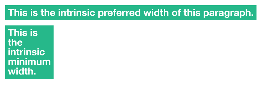
- max-content
-
The intrinsic preferred width. The
max-contentwidth is, roughly, the width the content would have if no “soft” line breaks were inserted, i.e., if each paragraph is one long line. - min-content
-
The intrinsic minimum width. The
min-contentwidth is, roughly, the narrowest the box can get by breaking all lines at all possible break points. - fit-content
-
Same as
max-content.
The following experimental keyword values have been introduced in CSS3.
The following image helps understand the min-content and max-content values.

More about min-content and max-content:
The min-content value is the narrowest a box can get by breaking all lines at all possible break points. In the above image, we saw how a text-only content can affect the container’s maximum width with min-content. The same concept applies if you have an image inside an element. The element is an inline-element, and therefore a break point is also possible after it. So, if the element contained a piece of text, and an image, the image is more likely to be wider than any word inside the paragraph (unless you’re using some fancy and super long words, of course), so the image can be the content that specifies the maximum width of the element with min-content.
Using max-content, the content inside the element will not break at any soft break points, and the text will be rendered as one long line, and the element can stretch to fit the longest line inside it, and that will be the maximum width it can get. But the text doesn’t have to be displayed as one line, so it will break as normal. In this case, max-width will just be the same as width.
Notes
Negative values are not allowed.
The keyword values (in contrast to length and percentage values) are not influenced by the box-sizing property, they always set the size of the content box.
Available, max-content, min-content and fit-content are equivalent to none when set on the max-width of vertical elements (when the writing mode is vertical, i.e. the writing-mode property has a value of vertical-rl or vertical-lr).
Examples
max-width: 250px;
max-width: 50%;
max-width: 100vh;
max-width: inherit;
Live Demo
View this demo on the Codrops PlaygroundBrowser Support
The max-width property works in all major browsers: Chrome, Firefox, Safari, Opera, Internet Explorer, and on Android and iOS.
The new experimental values added in CSS3 are not yet supported in all browsers, and some of them have different equivalents supported in some browsers. The browser support for the new values is shown in the following table:
Intrinsic & Extrinsic Sizing
Allows for the heights and widths to be specified in intrinsic values using the `max-content`, `min-content`, `fit-content` and `stretch` (formerly `fill`) properties.
W3C Working Draft
Supported from the following versions:
Desktop
- 46
- No
- No
- 33
- 11
Mobile / Tablet
- No
- 66
- No
- 66
- No
Notes
CSS 2.1 explicitly leaves the behavior of max-width with <table> undefined, so it is still not supported by all browsers.